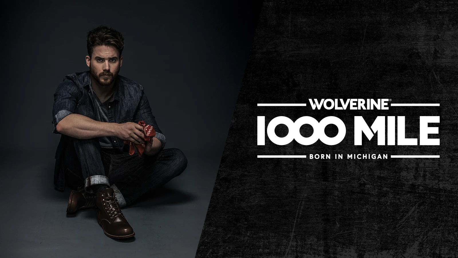
Wolverine
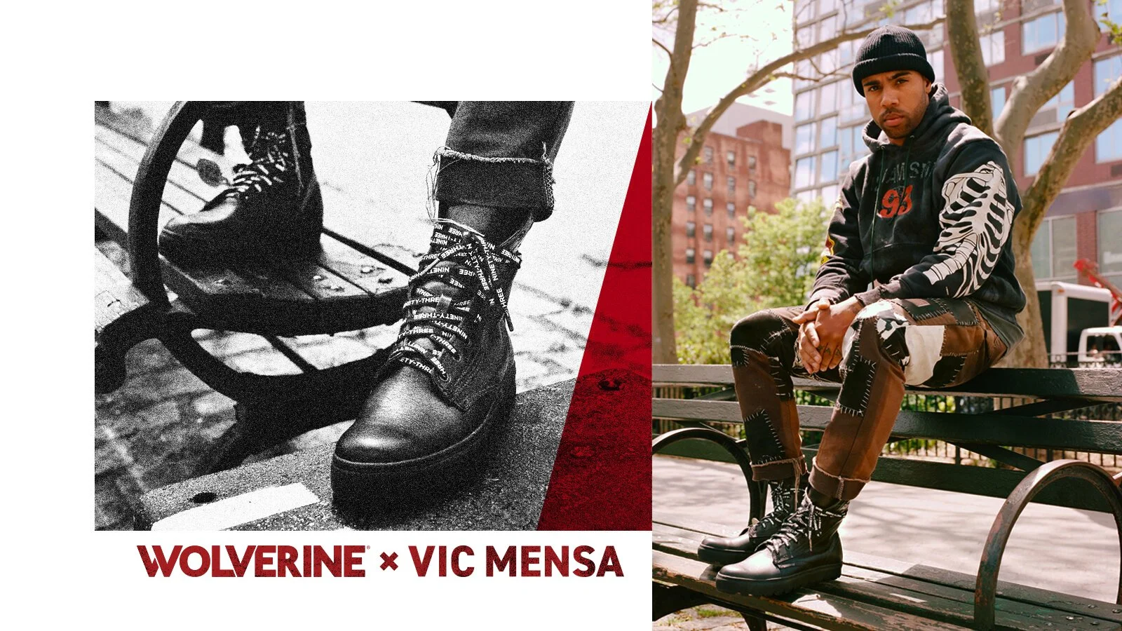
Over the last couple of years, I’ve been fortunate enough to play a part in the rebrand of Wolverine Boots. What started out as a quick brand refresh evolved into designing a new logo, including redrawing the iconic Wolverine Claw, developing a 70 page brand guide, and a complete overhaul of their website. Since then, we have gotten to help flesh out the brand further through new product launches, supporting the trades with Project Bootstrap, and collaborating with Vic Mensa and Metallica Scholars. Hell, we even released a craft beer with our pals at Torch & Crown.
While I’m extremely proud of all the work we’ve done for Wolverine, nothing quite tops seeing your logo embossed into a pair of Horween leather boots.
Thanks to Jeff Sciortino, Nolis Anderson, and Kevin Ryan for all of the incredible photography.
EDELMAN CHICAGO


SHIFTPLUS
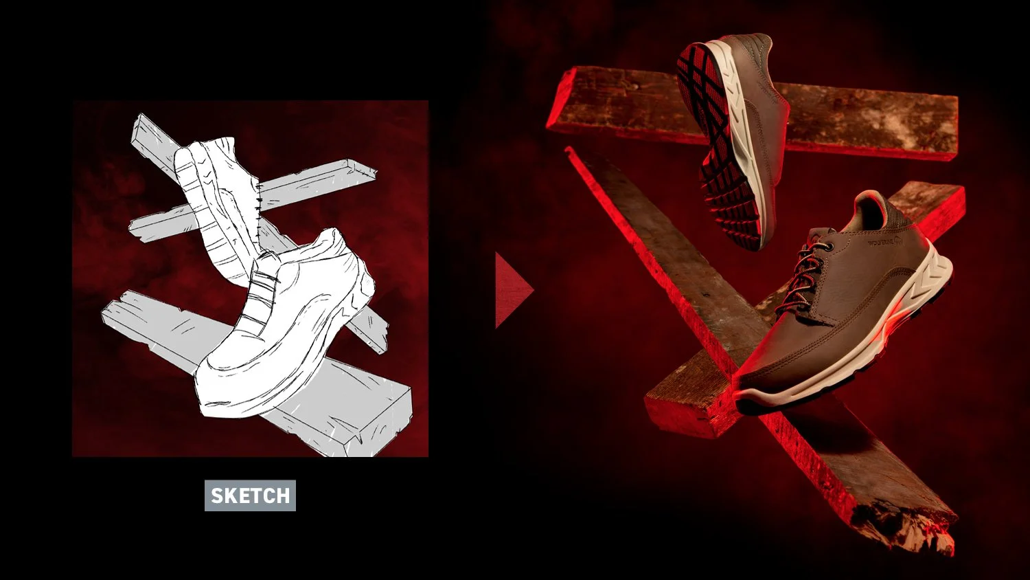
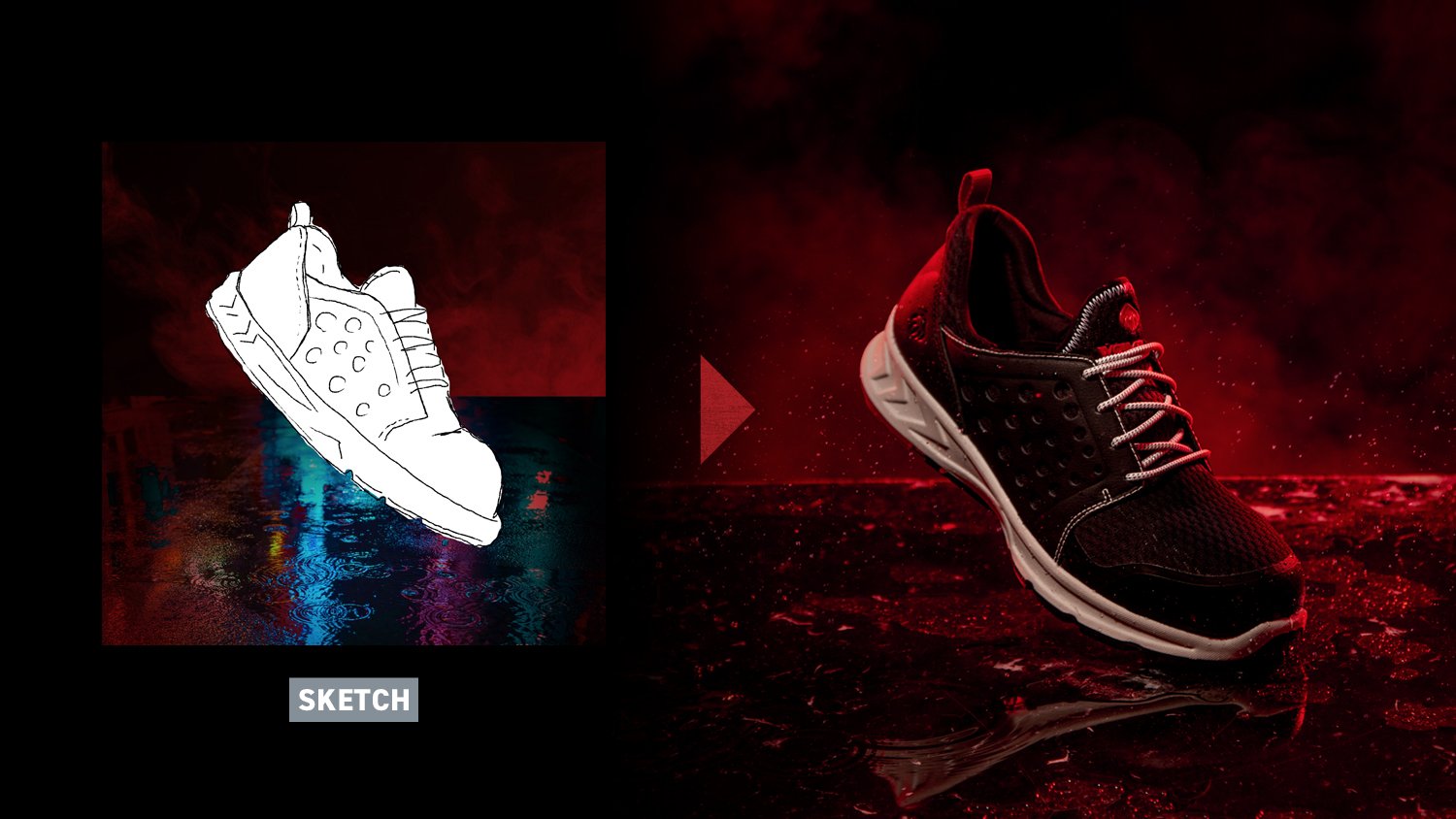
When Wolverine was developing a new product that featured the toughness of their work boots with the comfort of sneaker, we worked hand-in-hand to develop a name for the line, a vision for the shoot, and a launch video. The look overall is very clean and dramatic with subtle visual cues representing each boot’s area of focus (work, outdoor, city, etc).


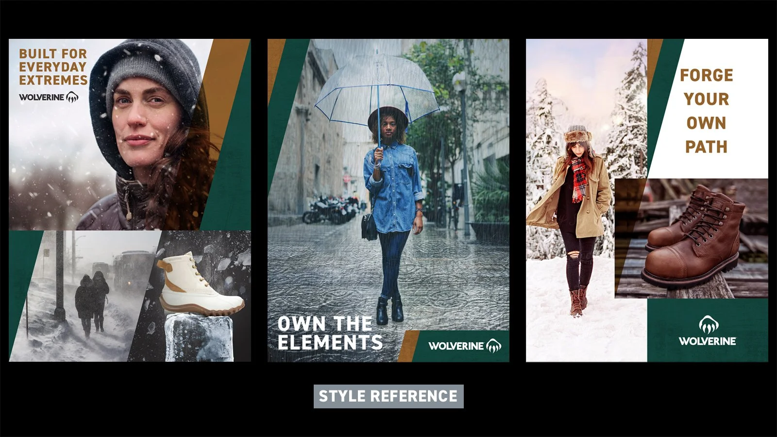
OUTDOOR
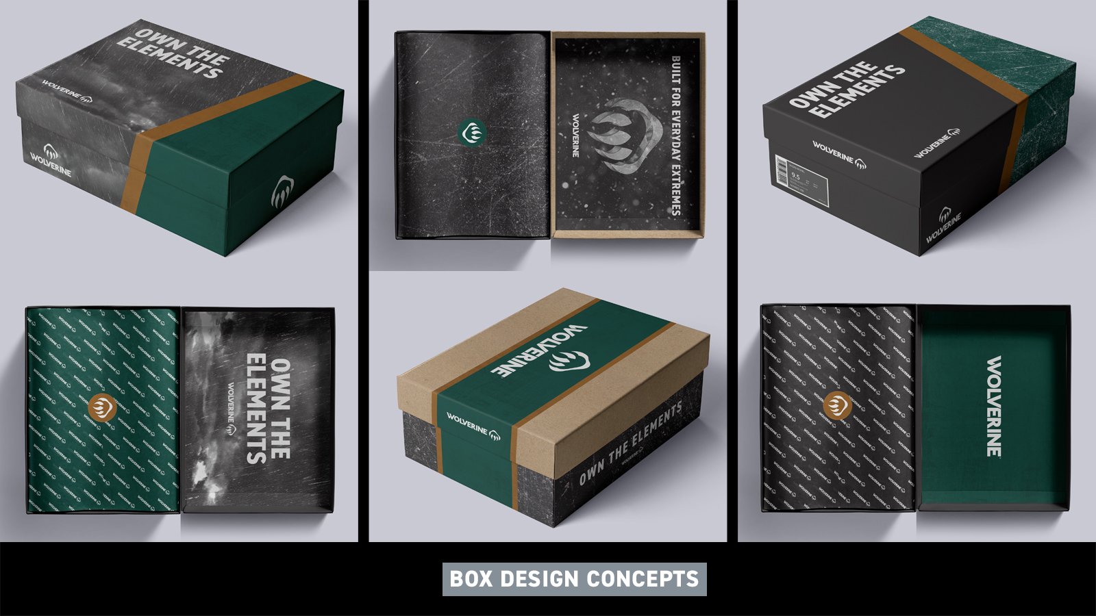
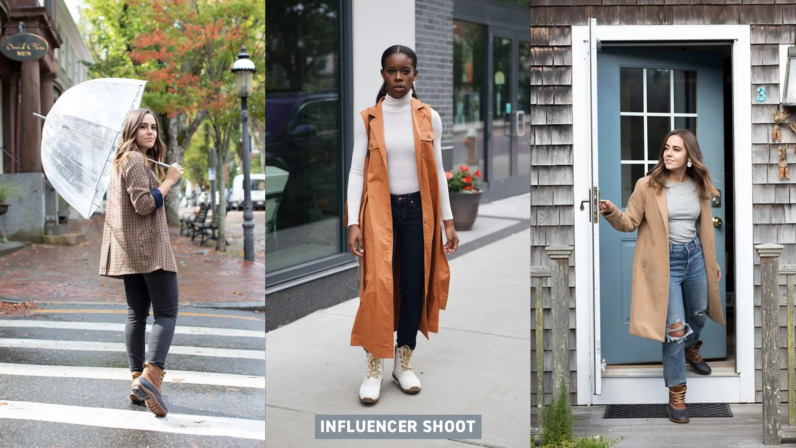
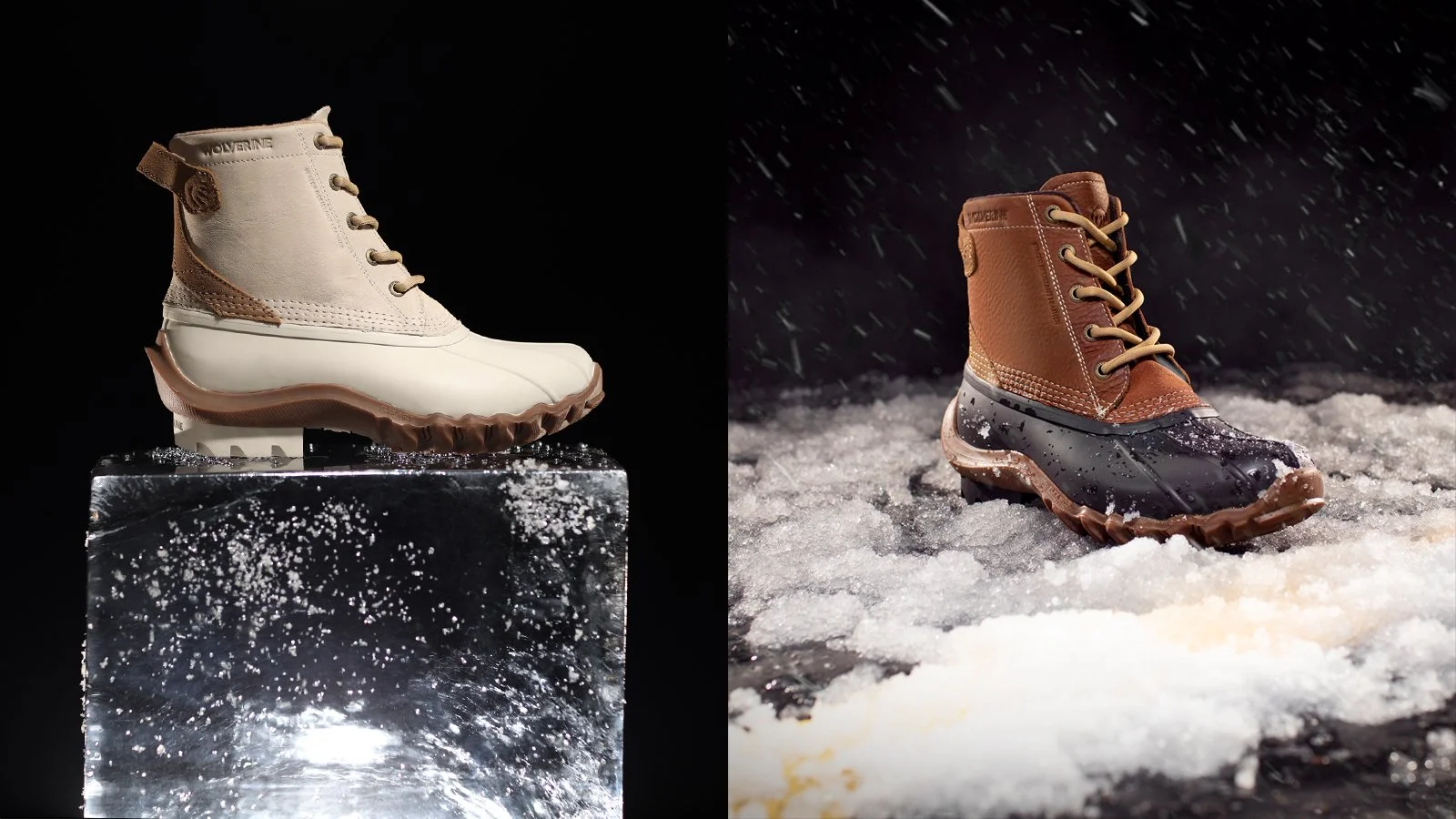
When Wolverine crafted their Outdoor line designed for women, we were tasked with developing a new look that would stand out from their Work line while still staying true to the brand. Below are concept designs that illustrate how this new line could live across print & packaging, along with some of the final shots from our influencer campaign and product shoot.


PARTNERSHIPS
Selects from various partnership programs over the past couple of years.


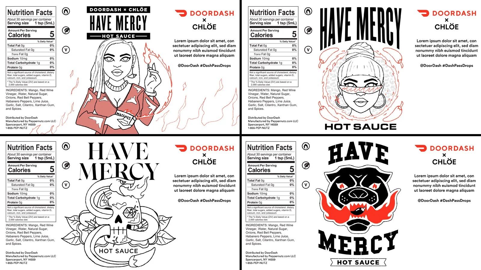
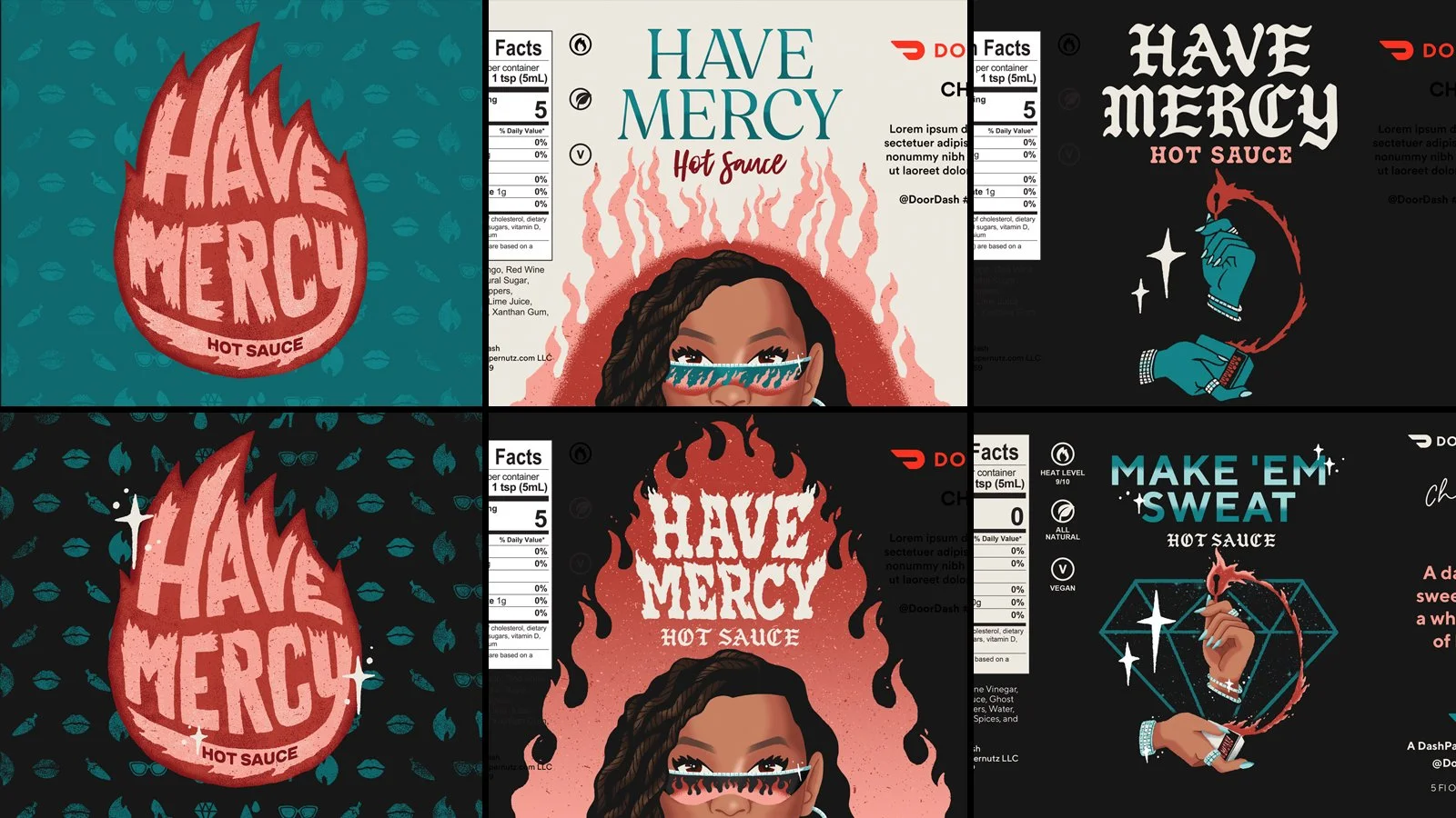
DoorDash + Chloe
When DoorDash partnered with singer Chloe Bailey for a new hot sauce, I was brought on to illustrate a label that spoke to both Chloe’s couture aesthetic while still feeling at home on an episode of Hot Ones.
EDELMAN CHICAGO


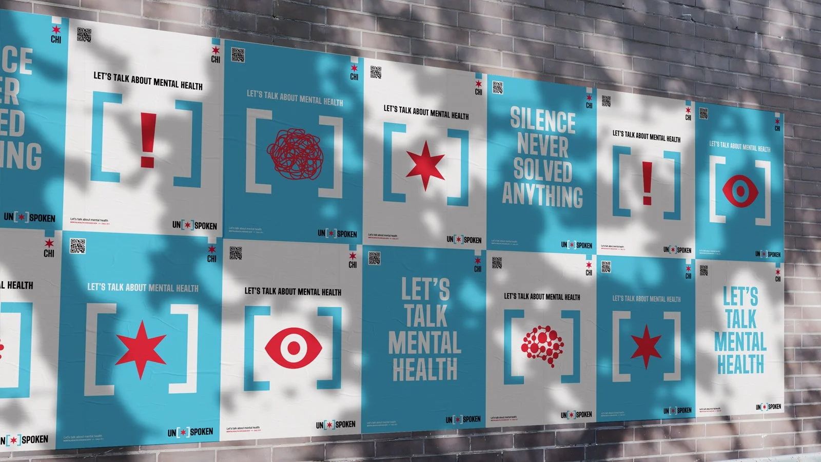
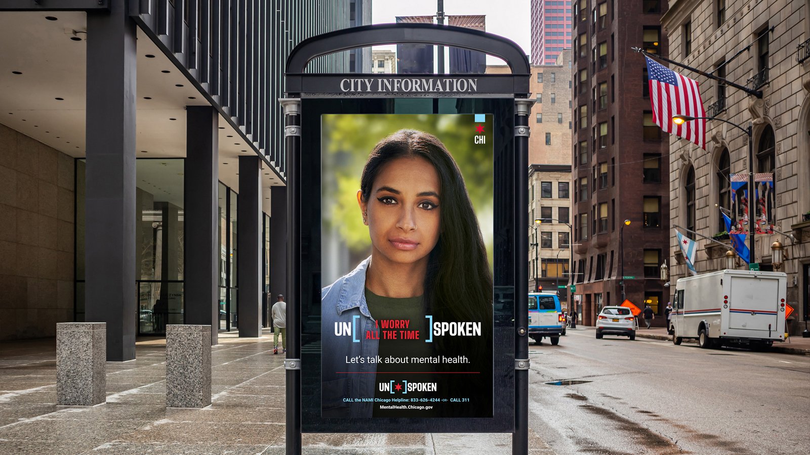
Unspoken
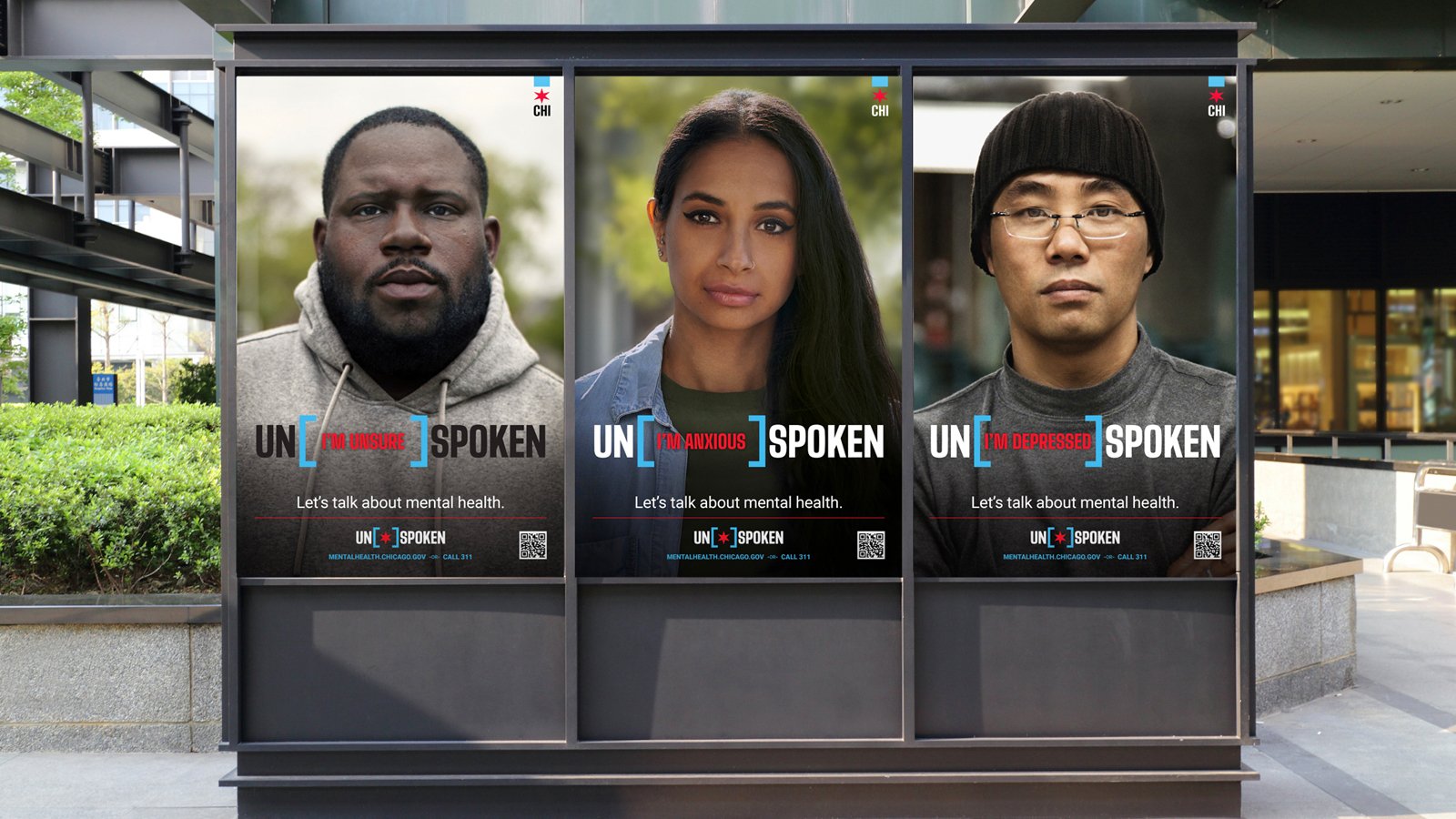
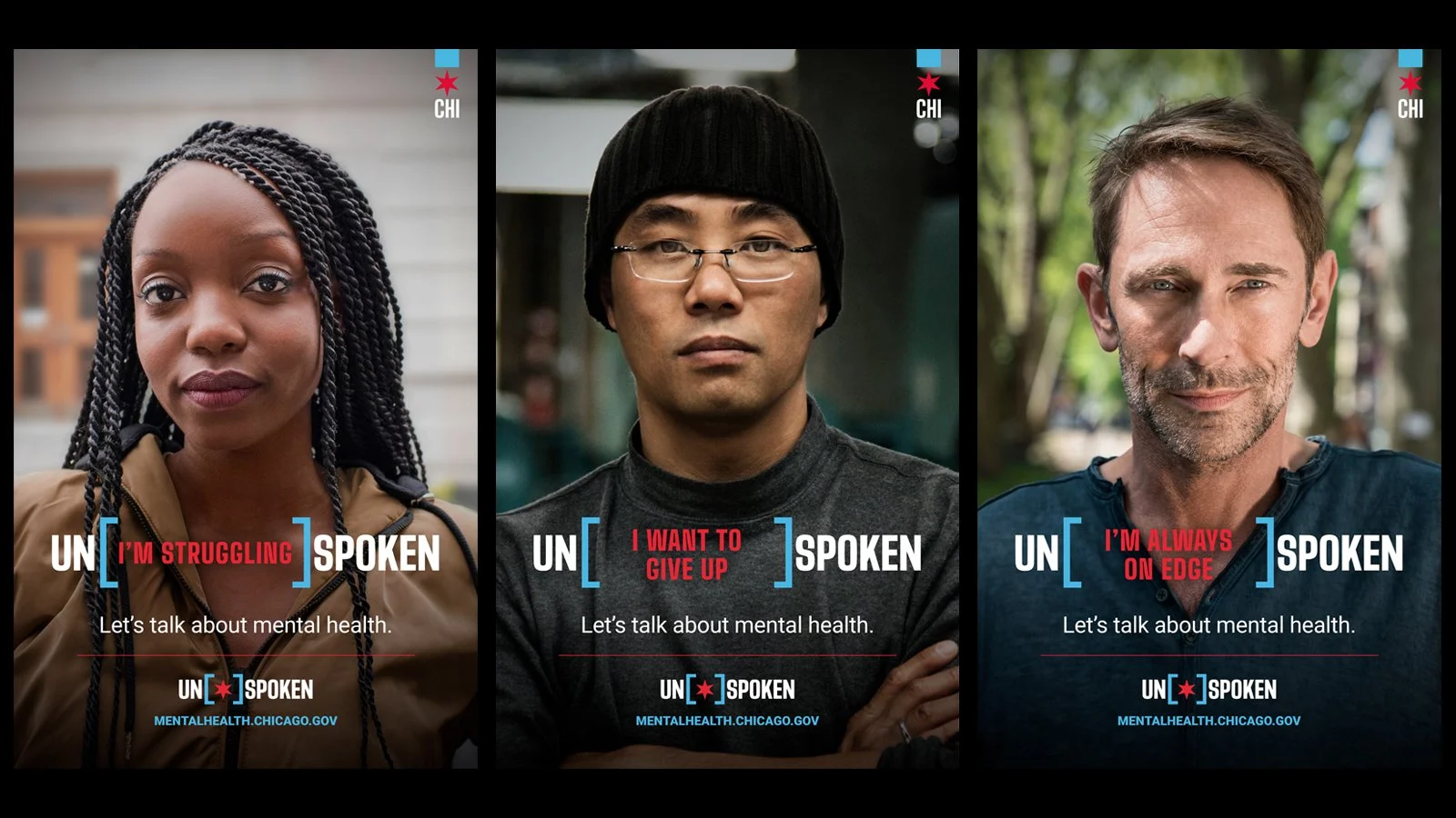
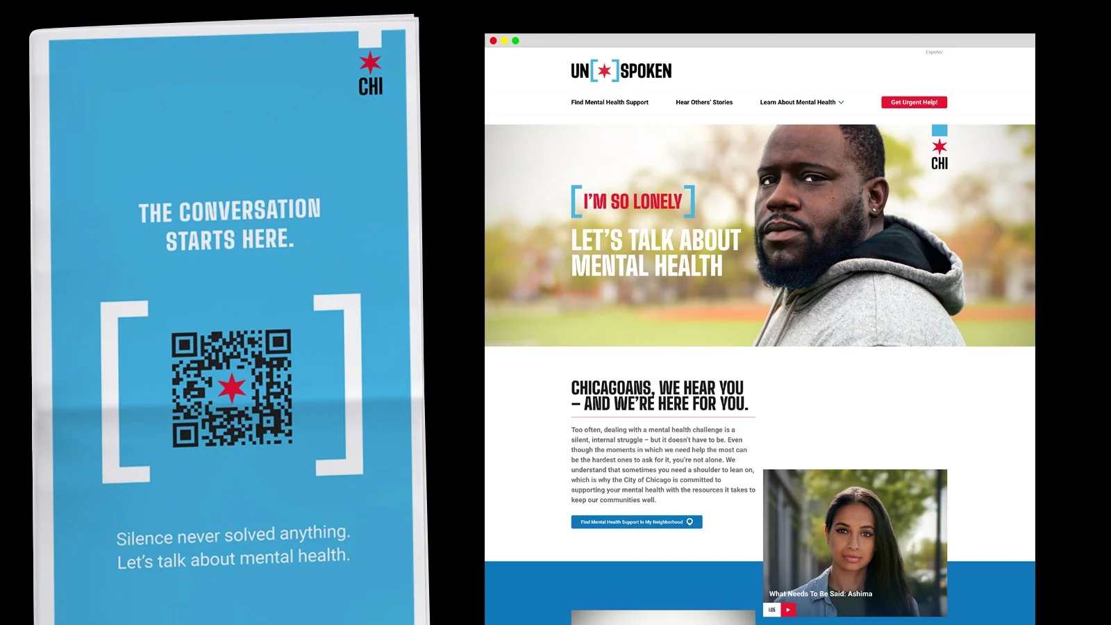
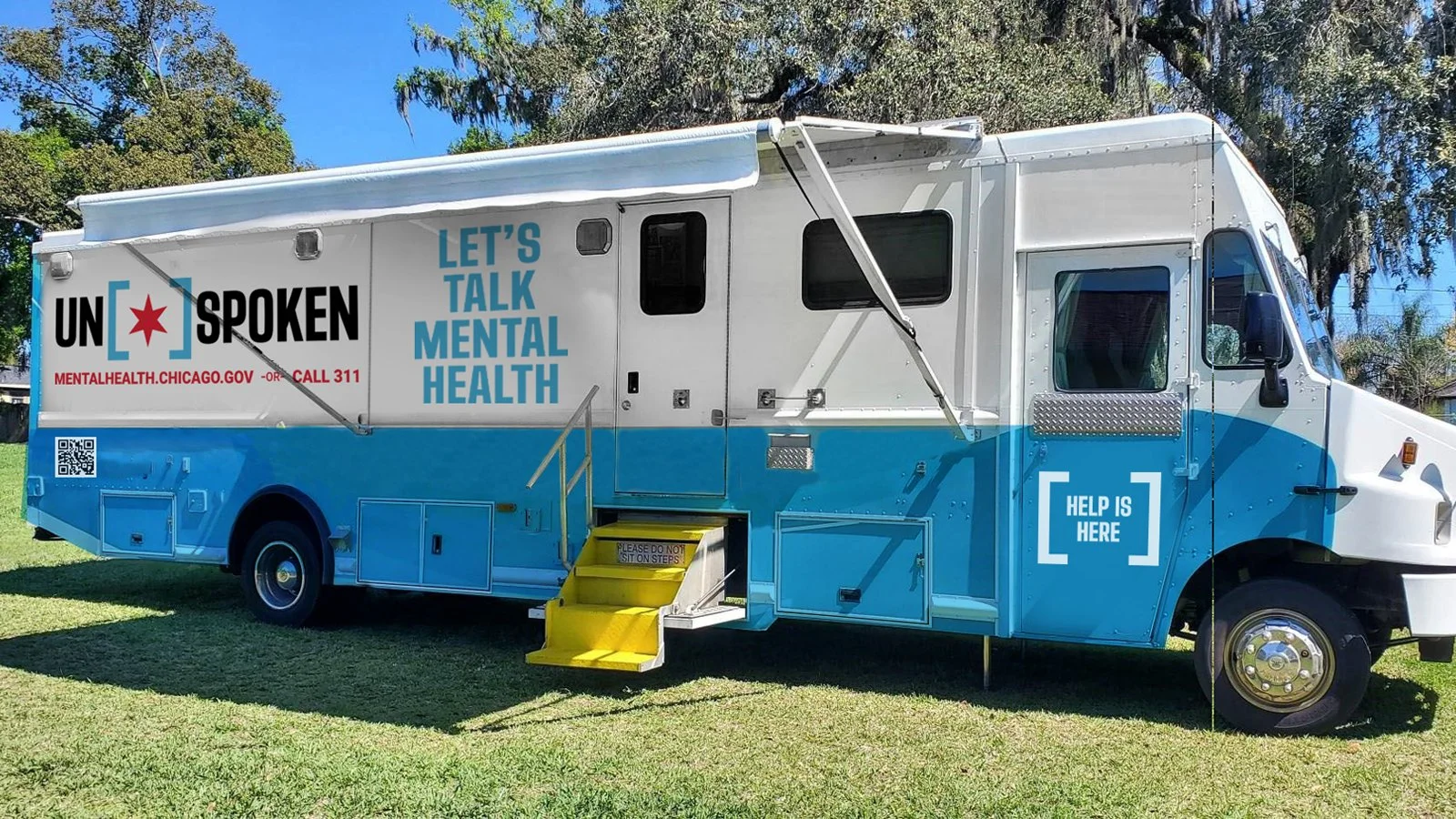
During the height of the pandemic, Edelman worked with the City of Chicago to develop a campaign to help provide resources and discourse around mental health. We developed a simple graphic system that leaned into CoC’s brand guidelines, and created a campaign with real Chicagoans at heart of it. The campaign was spread across the city through billboards, digital signage, full-page ads in all the Chicago papers, along with video and social.
EDELMAN CHICAGO
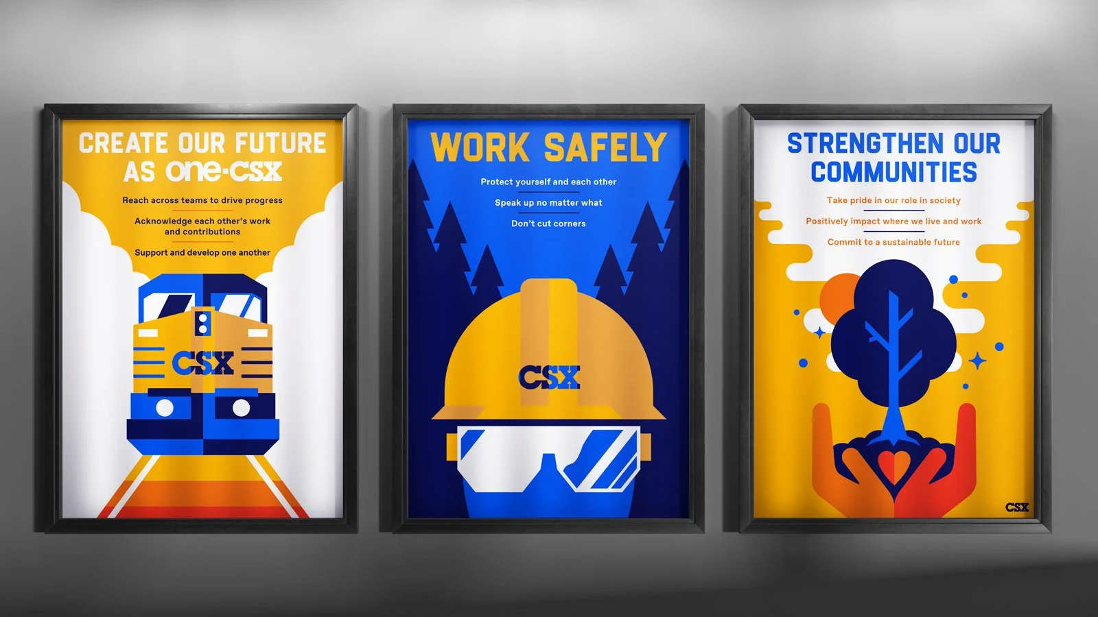
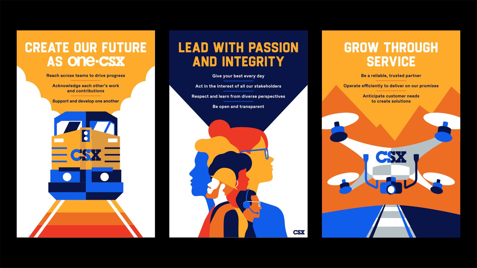
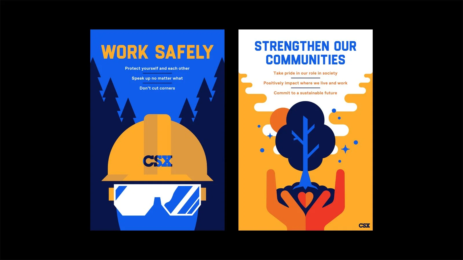
CSX
To help launch CSX’s new internal One-CSX program, we created a series of vintage-inspired posters that illustrates the company’s values and ideals. The bright and arresting posters will be displayed across the country in CSX’s corporate offices and at their train stations. We also developed a brief guideline to give guidance on how to incorporate these designs into other CSX materials.
EDELMAN CHICAGO
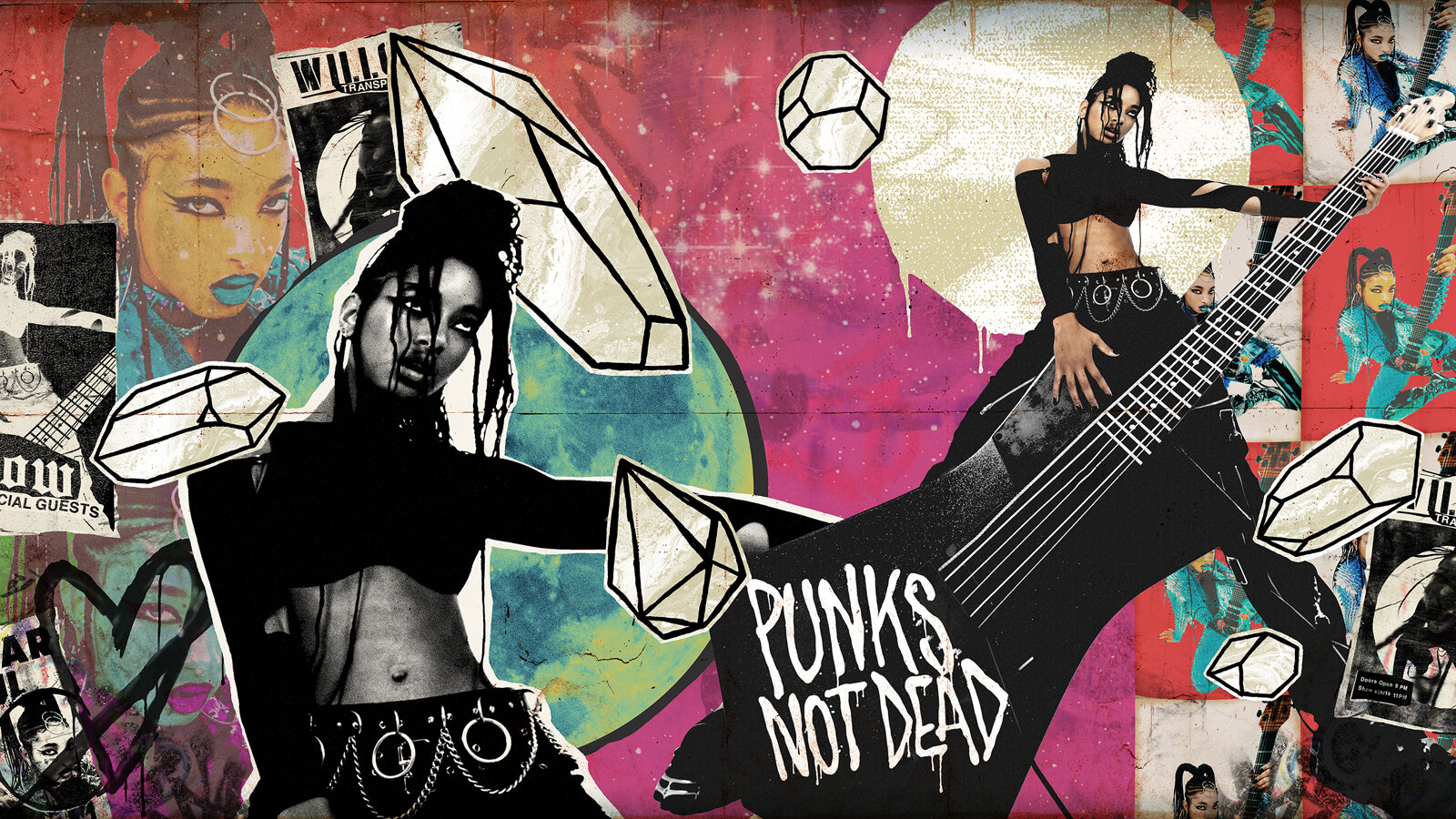
Willow on Fallon
For Willow’s performance on The Tonight Show with Jimmy Fallon, I got to cover the set’s massive 18ft wide and 10ft tall walls with street art and wild postings. Given Willow’s pop punk leanings, I tried to give the piece some Warhol meets CBGB type vibes. Won’t lie, getting to watch Travis Barker play drums in front of my work live on The Tonight Show was a trip. (still team coco all day tho)
Art direction by Eric Larson
FREELANCE


Kellogg’s
Over the years at Edelman, I’ve been fortunate enough to work on numerous pitches and projects for the historic Kellogg’s brand. Whether it’s been developing pop-up events, video content, or just helping them be more open with their audience, it’s always a ton of fun getting to work with such iconic brands as Frosted Flakes, Froot Loops, and Pop-Tarts.
EDELMAN CHICAGO
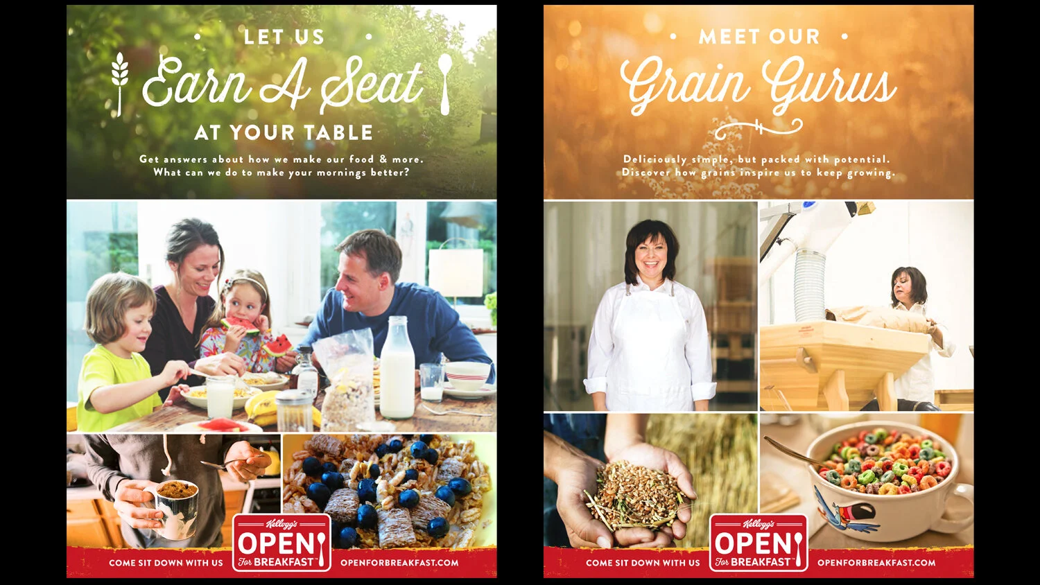
OPEN FOR BREAKFAST
One of the largest projects I worked on for Kellogg’s was the naming, branding and development of their Open For Breakfast platform. OFB was a way for Kellogg’s to be open and transparent with their customers about the process in which their food is made, what all goes in their cereals, and their core food beliefs. Through video essays and long-form interviews, we spoke candidly with everyone from food scientists to plant workers, and from the CEO to their farmers. One of the biggest aspects of the program was giving the customers the ability to ask Kellogg’s hard-hitting questions directly to help build a truly 360° dialogue through the OFB website.


POP-TARTS TRICK AND TREAT
When Kellogg’s had their restaurant in Time Square, Kellogg’s NYC, we got to help develop several takeover events for their various brands and product launches. My personal favorite was a Halloween themed pop-up for Pop-Tarts called Trick and Treat where we really got to lean into the spooky and macabre. Based around my skull Pop-Tart logo illustration, we got to develop a giant window mural, a spooky photo shoot featuring eyeballs and dentures made out Pop-Tarts, social assets, and more.


FROSTED FLAKES x PRETTYMUCH CHOCOLATE RECORD
For the launch of Chocolate Frosted Flakes, we teamed up with the boy-band PRETTYMUCH to release their single “Hello” on the world’s first ever 7” record made entirely out of chocolate! Given the record’s size and fragility, we housed the slab of chocolate in a custom box with full wrap-around graphics and a booklet. This was a truly unique piece to work on and a major labor of love from all parties involved, but the end result sounded great and tasted even better!


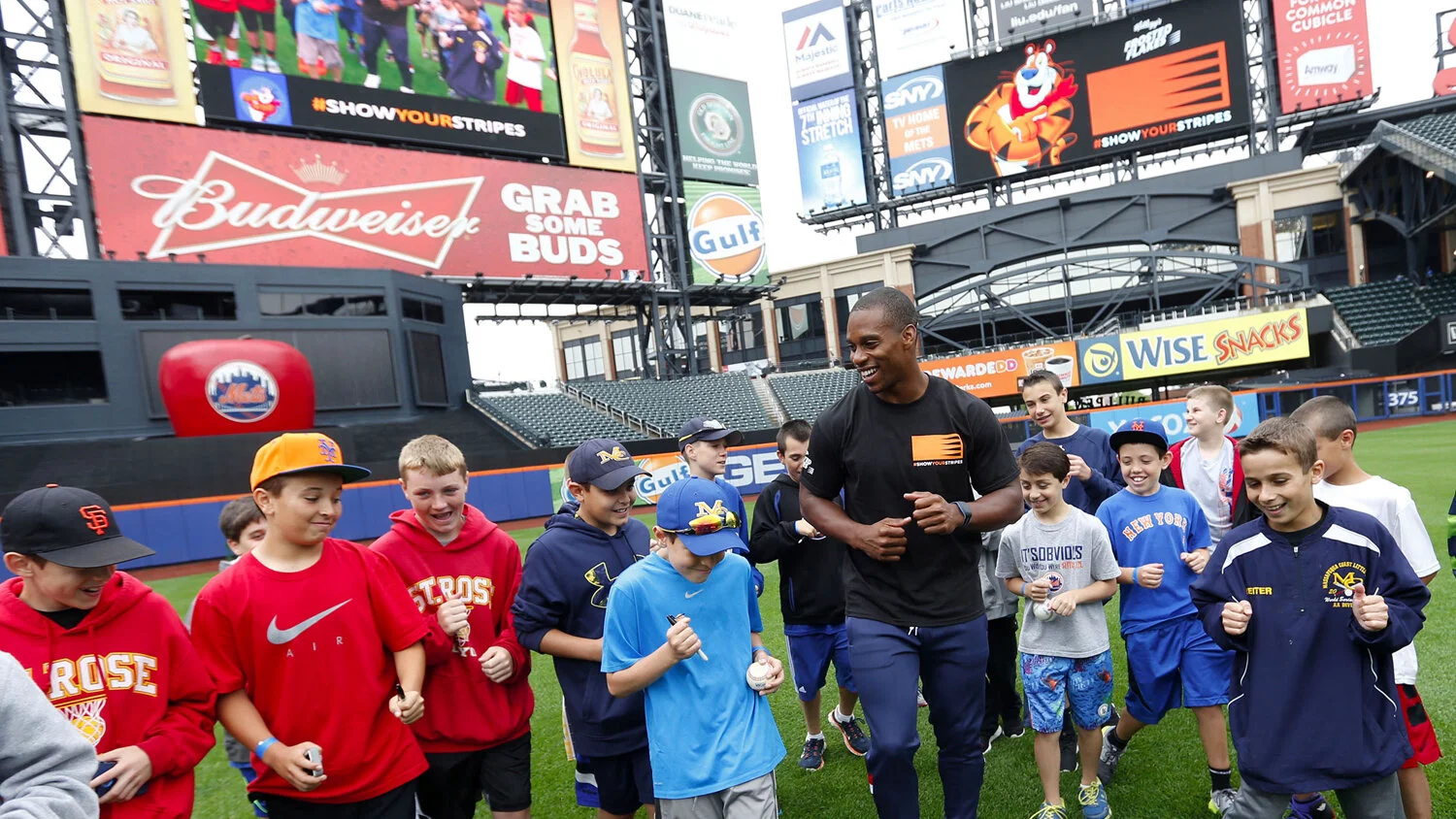
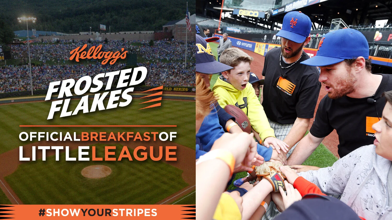
FROSTED FLAKES SHOW YOUR STRIPES
Frosted Flakes has always encouraged kids to be active and to be themselves, so a partnership with the Little League World Series was truly a home run. We helped name and develop a brand system around Show Your Stripes, which included a ton of swag, social assets, and even graphics for stadium jumbo-trons.

BOX DESIGNS
Over the years we pitched several dramatic box redesigns for various pop-ups and programs. While none of these came to fruition, surprisingly enough, the trippy blacklight Froot Loops box got pretty far along the process before Kellogg’s got cold feet.

Jack Daniel’s
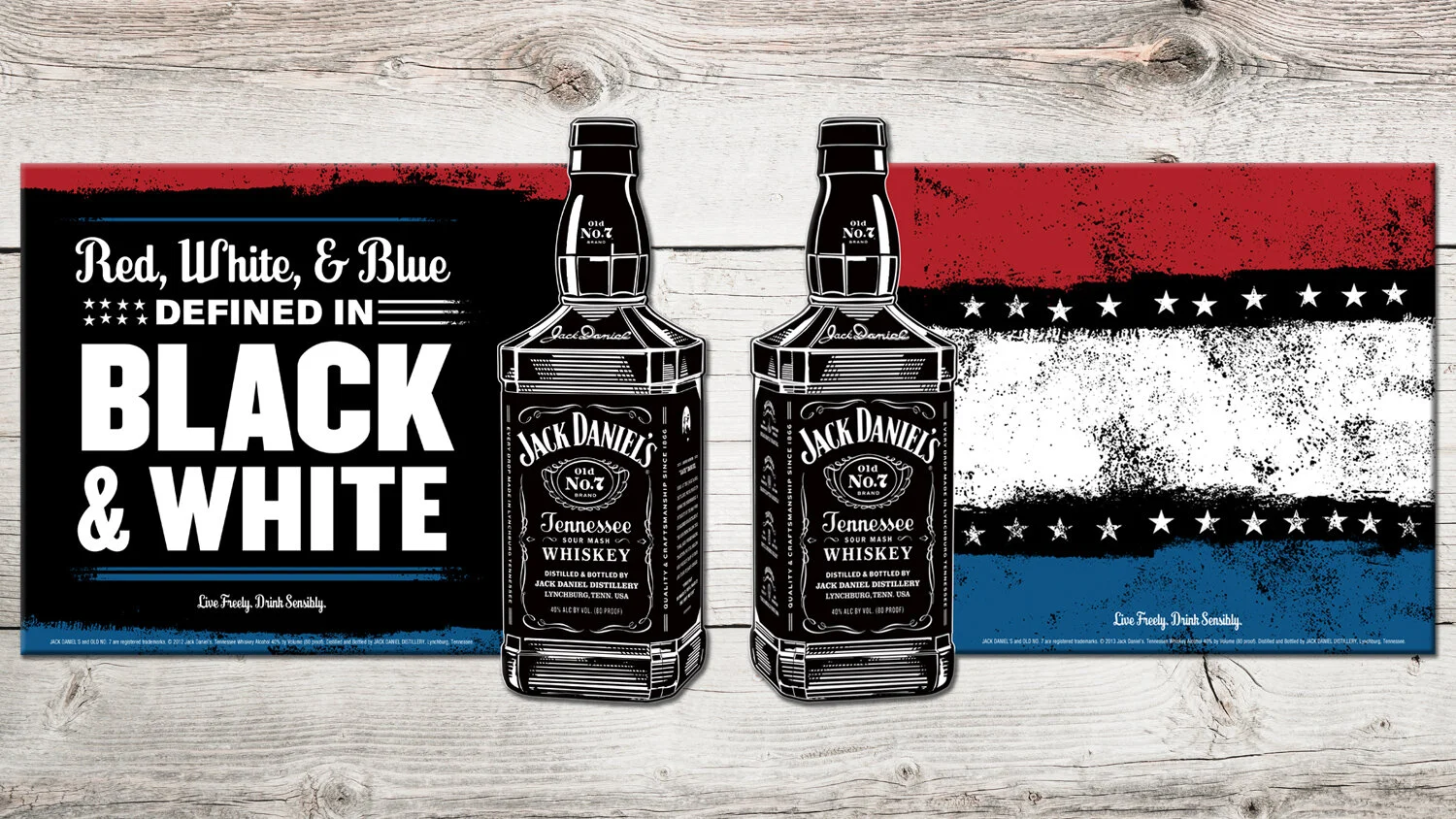
While at DRAFTFCB (now just FCB), I was the lead-designer for the iconic Jack Daniel’s brand. Our piece of the business was developing all of their in-store signage and marketing, which included everything from giant 3D mass displays to shelf violators, and from recipe books to floor clings. Jack has an aura and swagger to it like no other brand, and through dynamic typography and bold accent colors we tried to bring that vibe to the shelves of liquor stores across the country.
DRAFTFCB


Wrigley
The Wrigley Oral Healthcare Program started out as a simple website refresh and email program for the dental industry, but thanks to a little Tooth character I doodled, it quickly evolved into something much larger. The project started shifting to be more focused on providing helpful materials and social graphics for dental offices to educate their patients about how simply chewing gum after you eat can do a lot of good. Our Tooth character was soon center-focus for a line of posters (that were translated in several different languages), a series of animated gifs, an Orbit gum dispenser, and numerous infographics/listicles that brought in a wide range of different characters.
EDELMAN CHICAGO


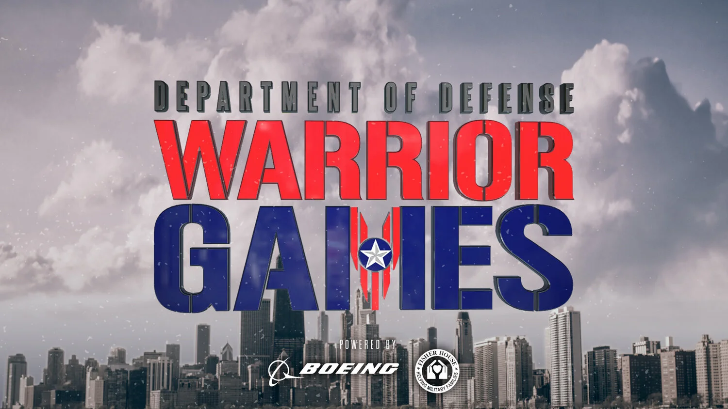
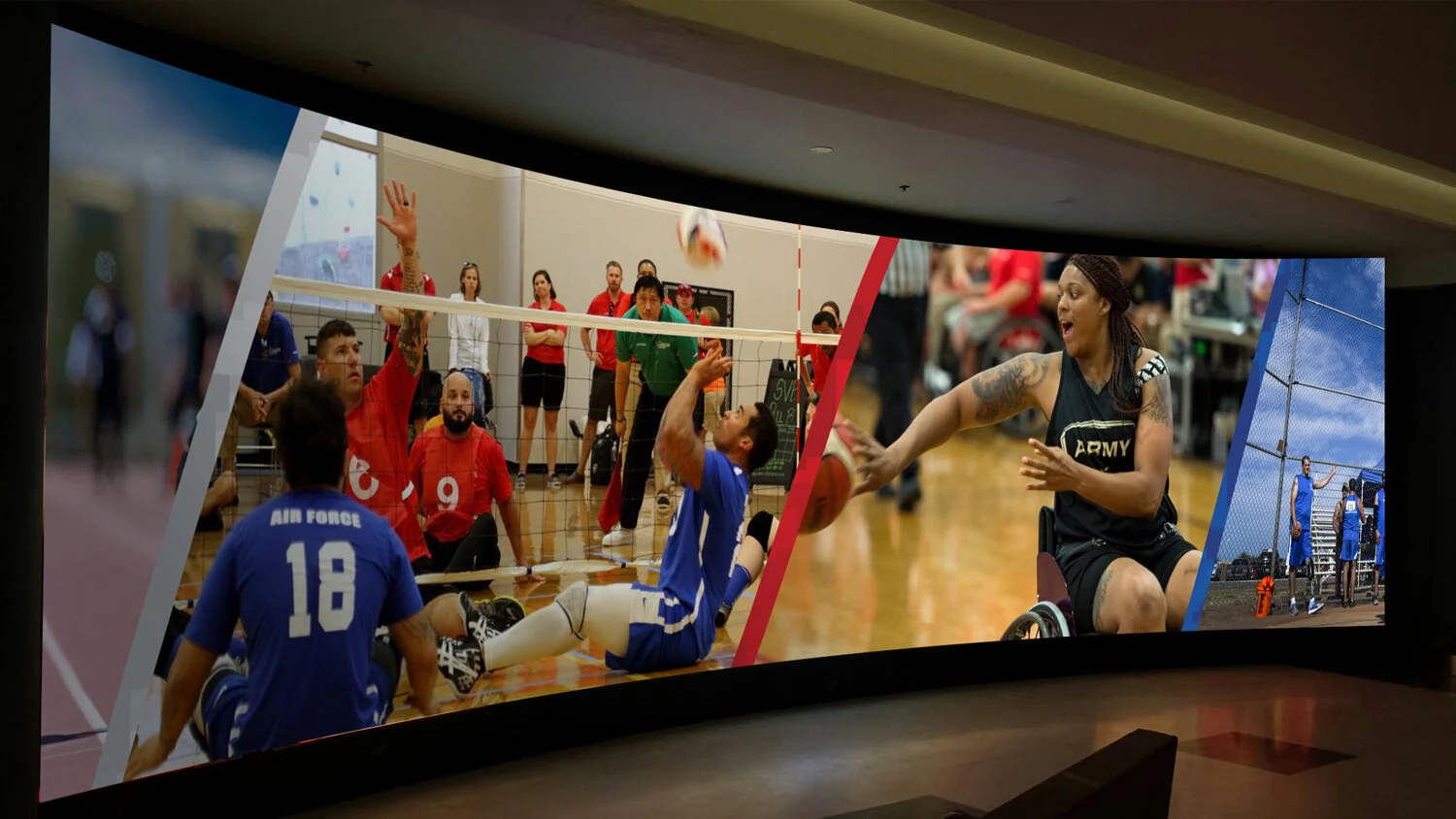
Warrior Games
The Warrior Games is a multi-sport event for wounded, injured or ill service personnel and veterans organized by the United States Department of Defense. Normally held on military bases and invite only, the 2017 games were open to the public and held at the United Center and Soldier Field here in Chicago. It was an absolute honor to play a small part of such an inspiring event. I was fortunate enough to design the icon system for the events, as well as lead design on all of the graphics and wayfinding for the United Center. The team and I spent weeks sitting in the rafters designing and redesigning all the different LED panel animations and elements. Definitely one of the most ambitious and gratifying projects I’ve gotten to work.
EDELMAN CHICAGO


Branding
I have always been drawn to branding, logos in particular. I love creating new letterforms and icons. And then creating a system for the logos, develop a brand. It’s all about the lil details.So, basically saying, you got a big Saul Bass fan over here, y’all.
Below is a small collection of logos that I’ve designed.
EDELMAN CHICAGO & FREELANCE


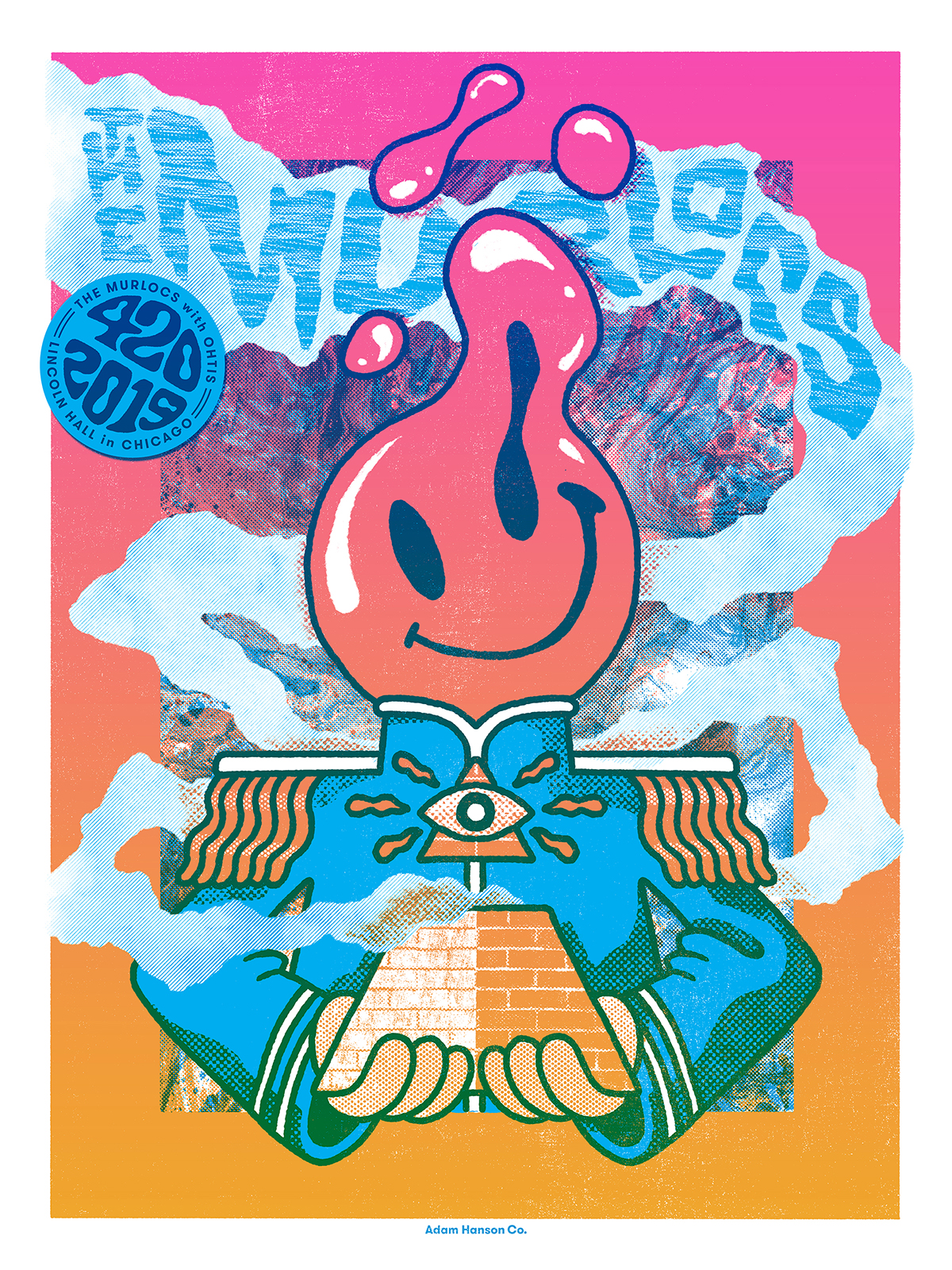
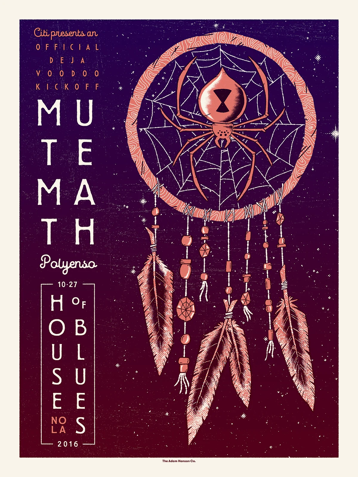
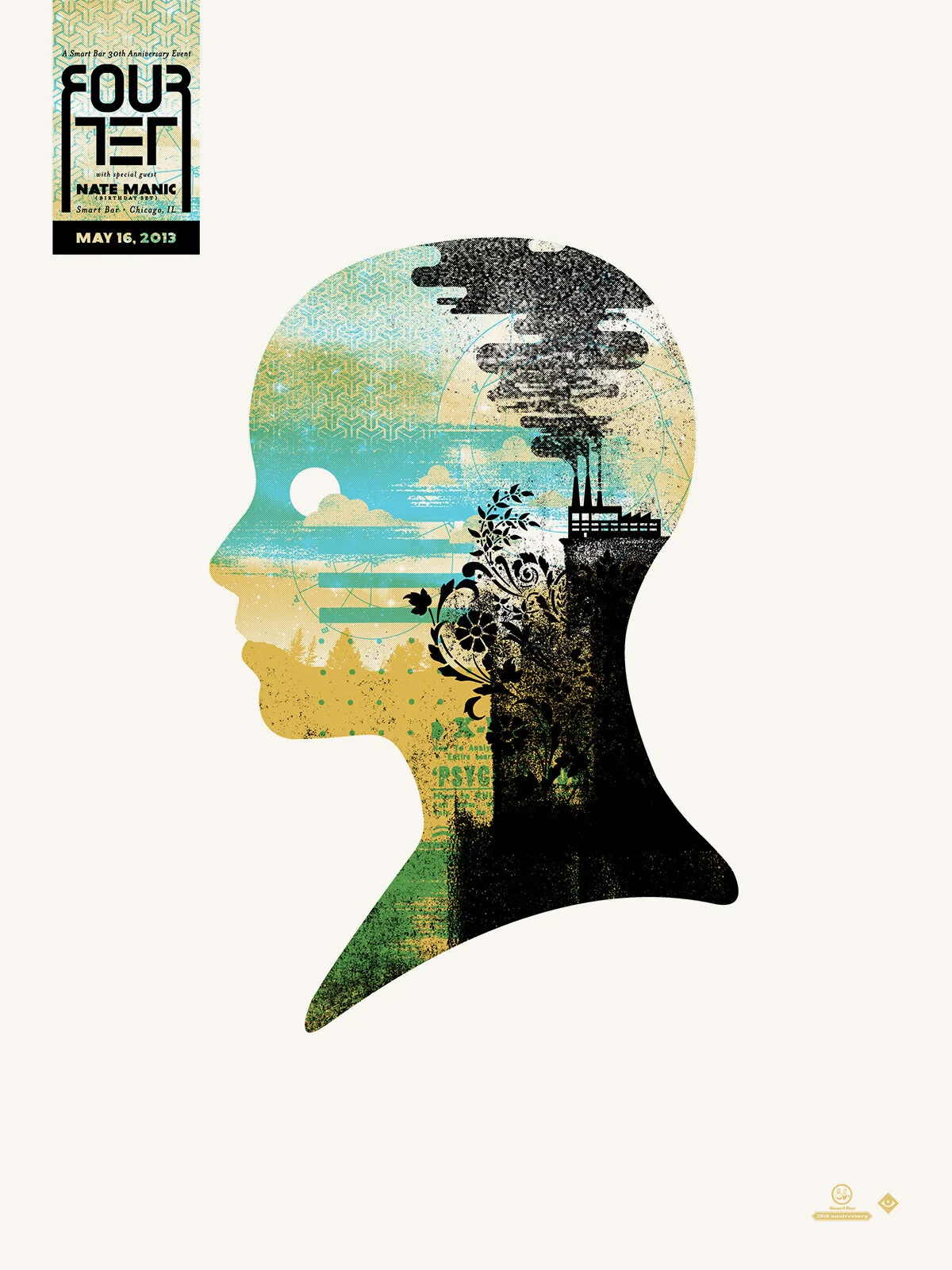
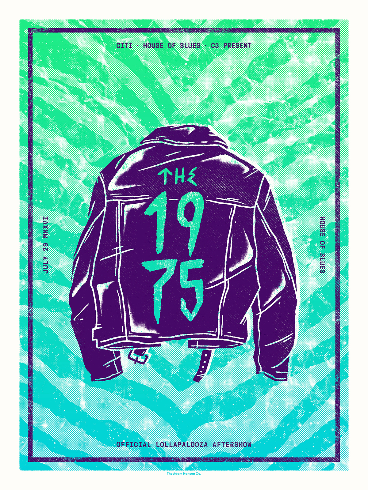
Gig Posters
For about a decade now, I’ve created bright and bold, 18”x24” gig posters for some of the biggest touring bands in the country. I learned all about the squeegee arts at DDL, and have used the medium to explore a wide range of styles over the years. Gig posters are just the best, man. Getting to setup a booth and hawk my prints at music festivals every summer ain’t too shabby either.
FREELANCE